As part of a company-wide initiative to modernize a newly acquired expense management platform, our team tackled the challenge of its overly complicated interface. As the lead designer on the project, I partnered with our research team and product owner to strip away the clutter and focus on what really mattered to users in their day-to-day work. The result? A streamlined interface that made expense submission painless and intuitive, which users actually enjoyed using – something reflected in our improved satisfaction scores and reduced support needs.

Facilitated design thinking workshops with the UX team to define problem space and opportunities
Partnered with UX research to synthesize user insights and identify key behavioral patterns
Developed comprehensive information architecture to support complex enterprise workflows
Created and iterated on wireframes from concept to high-fidelity, implementing React component system
Collaborated with design systems team to ensure component scalability and consistency
Drove stakeholder alignment through regular presentations and strategic problem-solving sessions
Built consensus across cross-functional teams through effective design storytelling
Authored detailed documentation and specifications for engineering implementation
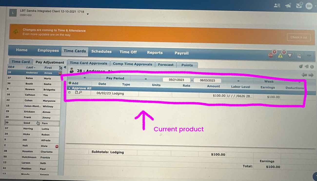
While working within the constraints of the existing codebase, I transformed a legacy interface into a modern, user-centric experience. Rather than a complete rebuild, the challenge was to innovate strategically within technical limitations – finding creative ways to enhance usability and design while preserving the underlying infrastructure. This required close collaboration with engineering to identify opportunities for improvement without compromising system stability.


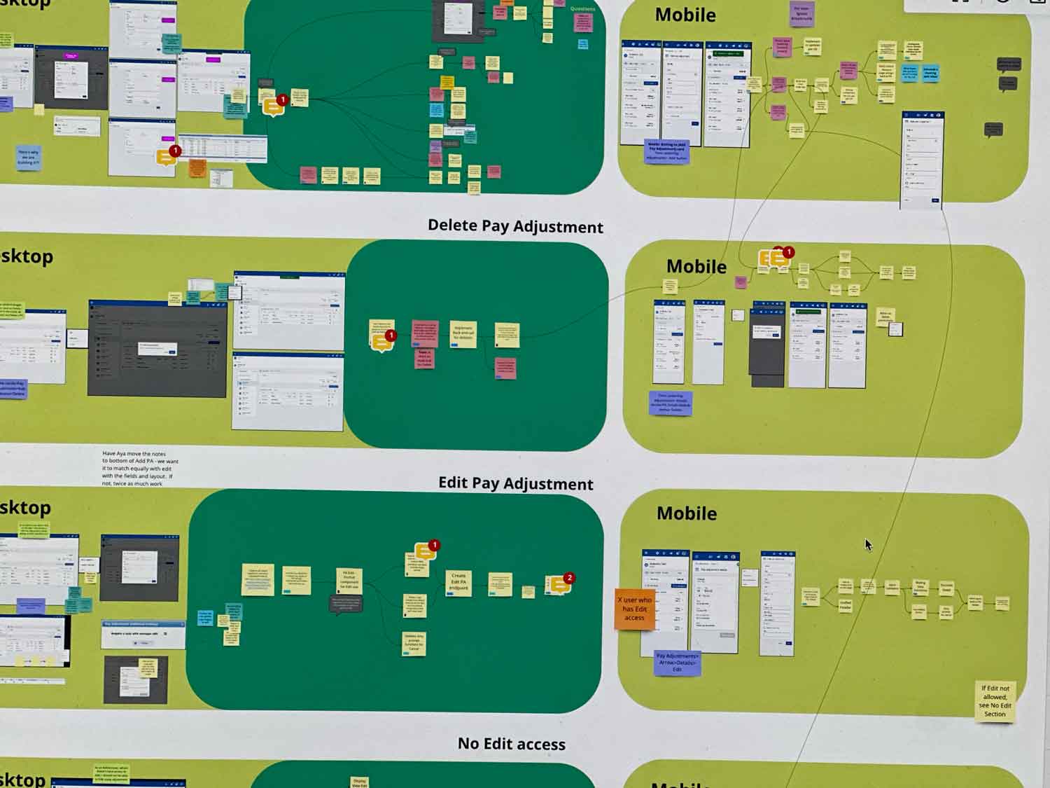
After the vision walk through the final step of this project was handing it off to the team and explaining the flows. We had a week of something called "idea day". On this day I proposed that we create a separate design for the mobile flow.
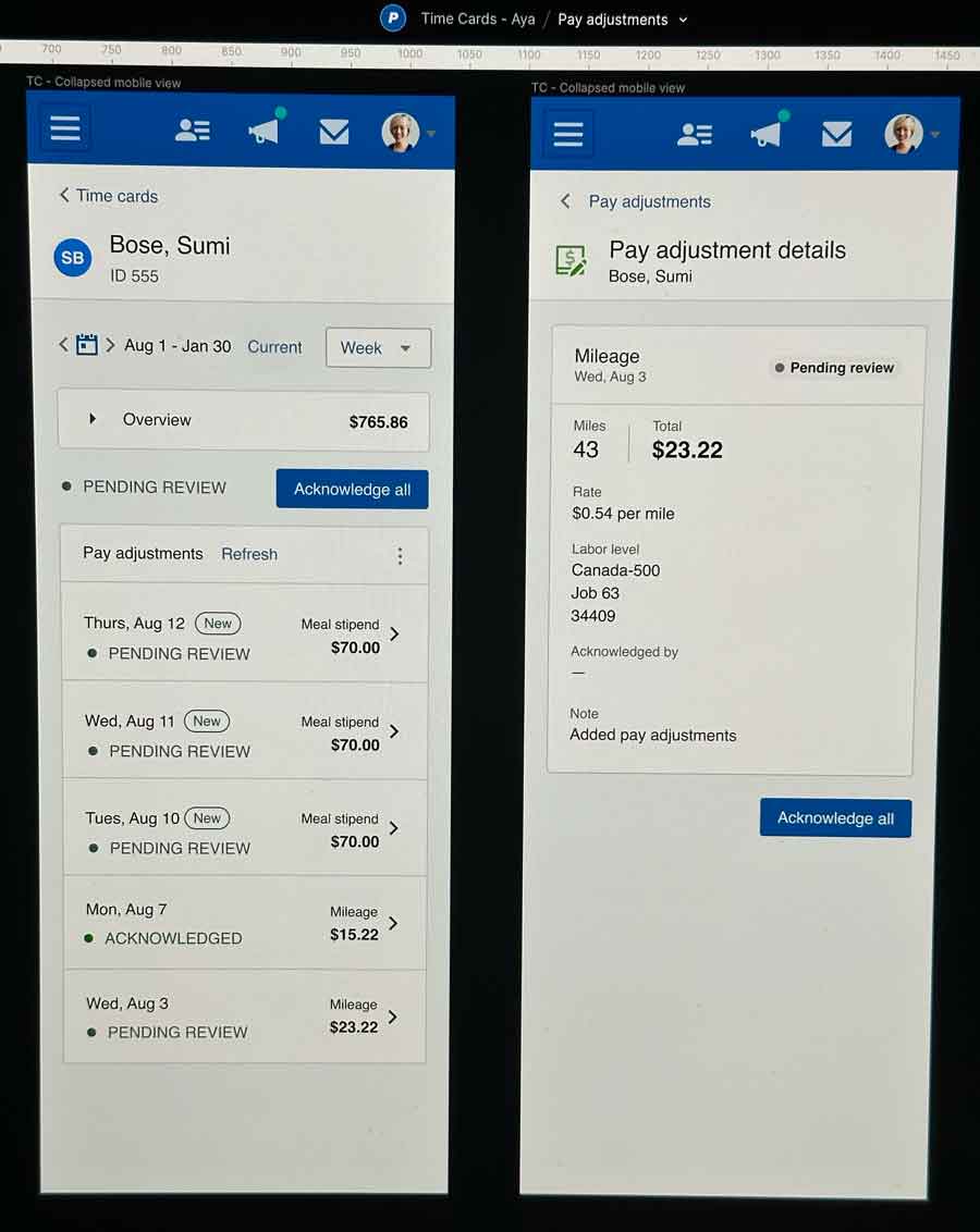
Towards the end of the project we had several meetings going through the accessibility issues that popped up. One was the status label for mobile, initially we just had it as a glyph, and then we decided that we needed the words as well. We also struggled with when to use expandable cards and when to have all the inputs visible. The best approach for our accessibility problems was trying to read the page like a story.
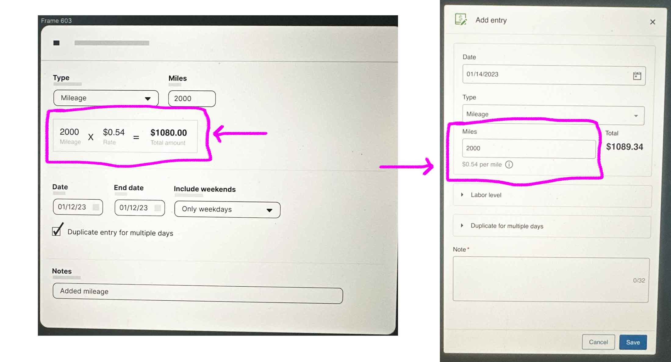
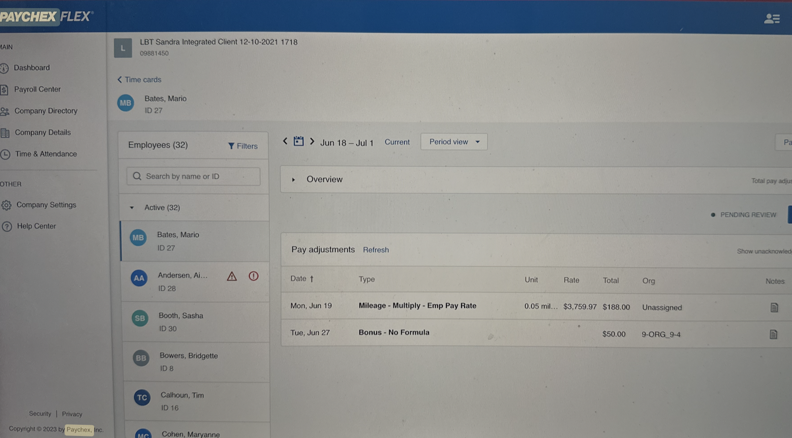
A key design challenge emerged when implementing mileage calculations. While our product owner advocated for displaying detailed calculation formulas, our team questioned whether this would add unnecessary complexity for supervisors who were already familiar with mileage rates. To resolve this, we conducted targeted usability tests with multiple design variations. The data helped us find the sweet spot between transparency and simplicity, while also aligning stakeholder expectations with user needs. This evidence-based approach led to a streamlined solution that satisfied both user preferences and business requirements.
During the final phase, I led a comprehensive walkthrough of user flows and design systems with the development team. During our 'idea day' sessions, I proposed and designed a dedicated mobile experience that would complement our desktop interface while maintaining the core functionality. This mobile-first approach ensured our platform would be accessible across all devices.