Case study 3

Payroll - Creating a user friendly time card

Project under NDA

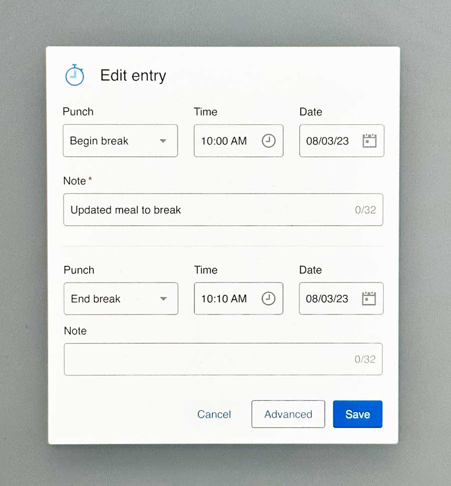
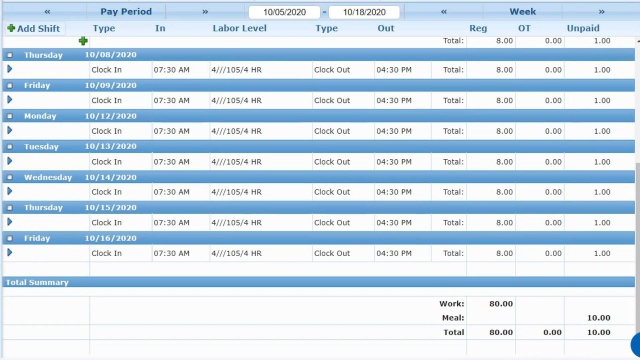
Our team was tasked with modernizing the legacy time card interface, focusing on core user workflows. We transformed a dated system into an intuitive platform where managers could easily review hours, make corrections, handle approvals, and apply overrides. Below is a comparison showing how we evolved the interface from its original state to our new Angular-based design system, significantly improving both functionality and visual clarity.

The process

Our design process began with a discovery phase to understand the existing system, followed by an initiative kick-off meeting to align stakeholders. We conducted in-depth user interviews to uncover pain points and needs, which helped us clearly define the problem space. Working closely with our team, we mapped features to functions, ensuring technical feasibility while maintaining user value. From there, we developed information architecture and task flows, which informed our wireframes as we iteratively refined the design from low to high fidelity. Throughout the process, we maintained continuous user testing and research to validate our decisions. We collaborated with our content team to develop a cohesive content strategy, provided ongoing development support, and concluded with a comprehensive UX review presentation to stakeholders.

Client

A Payroll Company

Date

March 2023

Role

Product Designer II

My Role


As the lead designer on the project, I focused on simplifying how managers review and approve employee time cards. One key challenge was the confusing system of 'punch types' - different ways employees could clock in and out, including meal breaks. Working with our research team, we gathered user feedback that showed simpler punch names would reduce errors and confusion. While we couldn't completely overhaul the punch type system due to product constraints, we redesigned how this information was presented to make it more intuitive for managers to understand and use.

The problem

Two key questions drove our redesign: How could we make the existing system more usable, and how could we help managers review time cards more efficiently?

The challenge was finding a universal solution that would work across different industries and company sizes. Rather than jumping into layout options, we first needed to understand what information was truly essential for users completing their core tasks.

I led multiple working sessions with our team to rethink how time card data should be organized. Working closely with our product owner, service representative, and business analyst, we initially assumed users needed constant access to all data. Through subsequent usability testing, we validated whether this assumption held true and refined our approach based on real user feedback.

Our goal was to make it easier for managers to handle their team's expenses and pay changes. During the project, we also added a new feature that let managers see and calculate their employees' travel routes. This addition was an opportunity for us to pitch what we wanted and ended up helping us not only simplify the overall experience but also give managers the tools they were asking for.
Our research revealed an interesting split in user preferences: half of our existing users initially wanted to keep the familiar interface, while new users preferred a more modern approach. Through prototype testing, we discovered that even hesitant long-term users embraced the simplified design once they experienced it. This insight helped us bridge the gap between maintaining existing user comfort and creating a more intuitive experience that would attract new users.
Making our time card system accessible was crucial, particularly for users relying on screen readers. Our key challenge was how to communicate complex time entry data and actions through ARIA labels effectively. We focused on three essential tasks for vision-impaired users: correcting wrong time punches, adding new entries, and reviewing daily summaries. While transitioning from Angular to React, we implemented interim accessibility improvements including clearly outlined links and explicit indicators for interactive elements like punch type and date selectors. This ensured users maintained a smooth experience during our technical migration.

The big challenge

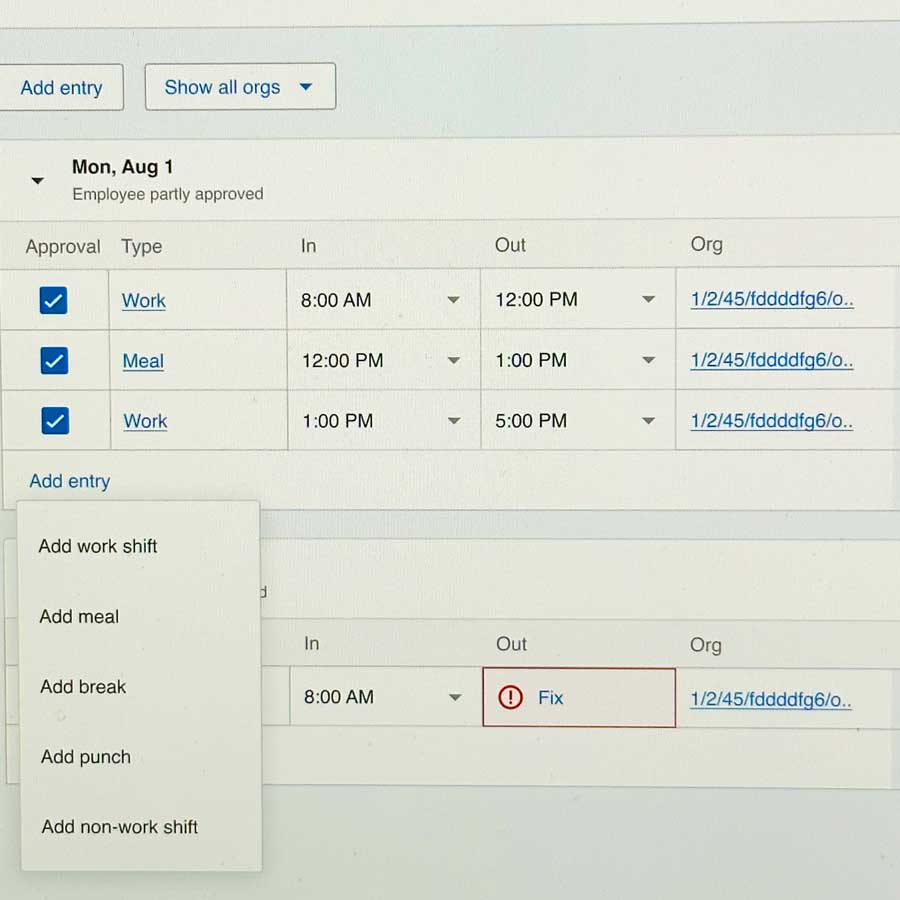
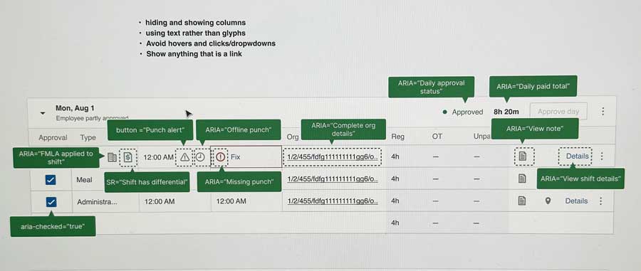
Our biggest challenge was improving the experience while working within strict technical constraints. Although my initial proposal required substantial backend changes, I successfully advocated for these modifications by demonstrating how they would significantly improve accessibility.Early discussions centered around showing all information at once, but our research revealed users preferred a cleaner approach. We pivoted to focus on what mattered most: making information easy to find and scan. This data-driven decision helped us transform a complex interface into one that prioritized user efficiency.

After numerous revisions we were able to deliver a simplified experience that was preferred by both our current users and target users as well.

By reimagining the timecard review process, we successfully transformed a confusing punch type system into a more intuitive interface for managers, all while working within existing product constraints. Through close collaboration with our research team, we identified that simplified presentation of time entry information would significantly reduce confusion and potential errors. The redesigned interface streamlined the review process for managers without sacrificing necessary functionality or requiring major backend changes. Throughout development, we conducted thorough design reviews focused on accessibility standards, ensuring the solution was usable for all managers regardless of their abilities. This data-informed, inclusive approach not only improved the day-to-day efficiency of managers handling time approvals but also demonstrated our ability to deliver meaningful UX improvements while respecting technical limitations and system requirements.